
A Great Book Cover
- Apr 10, 2024
- 3 min read
I think because the cover for my upcoming book, Closer to Far Away, has just been finalized, I’ve been giving a lot of thought to what makes a good cover. And I’ve come to the conclusion, that I have absolutely no clue. Oh, I know what I like and what I don’t like, but that’s not a very reliable measuring stick.
Case in point: I hated the cover for my hi-lo book, Chat Room (Orca Books/2006). Interestingly enough, more copies of that book have been sold than for any other book I’ve ever written (so far). Upon one of the reprintings, Orca gave the book a new cover which I much preferred, but I think the only reason for the change was to give the book a fresh look and make readers think it was new, though it had sold just fine with the original cover. Almost 20 years later, it’s still selling.


Another cover I was leery about was also an Orca book titled The Gramma War (2001). It wasn’t that I disliked the cover; I felt it didn’t accurately reflect the tone of the book. It made it seem humorous when, in fact, the subject was quite serious. That book got turned face out in more bookstores than I can count and like Chat Room, it sold well. It also is still in print. The score—art department 2/critical author 0.

Perplexed by my inability to predict what will attract readers, I headed to Google. I read articles by cover designers, critics, and others in the know, and the consensus seems to be that a good cover should:
· Hint at what the story is about
· Display the title prominently
· Be easy to view
· Reflect the genre
· Use appealing fonts and colours
Here’s my argument: a book cover can do all those things and still not be appealing. Conversely, a book cover can fail in several of those categories and still attract readers. On some covers the author’s name is more prominent than the title. I suspect that’s because the author is so well known, it doesn’t matter what the title of the book is. On other covers, the text is so dominant and tangled, I can’t read it at all (and that is an instant turnoff). Too often the artwork on the cover doesn’t make sense even after reading the book. And some covers are just plain wrong.


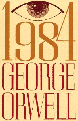
Some books have had many, many covers over the years, but they all reflect the same take on the story. 1984 by George Orwell is a perfect example. I must have come across a dozen different covers, but they all chose to emphasize the “big brother is watching you” message.


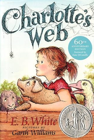
Let’s face it. Some covers – whether good or bad – have become iconic. That’s probably because the books have become classics. They’ve been around a long time and have been read by millions of people. Even without reading the title, we all recognize the book.


We are told we shouldn’t judge a book by its cover, but the fact is we do. That’s why they are so important. The book may be so much better than the cover introducing it, but on the other hand, a great cover can sell a terrible book. According to my research, the following book cover is excellent as far as design goes (easy to read, single focus, good contrast, inspires curiosity, image is symbolic and related to the story, and it’s not too busy.) I understand that the author is the one who came up with it. I haven’t read the series, and I’ve heard mixed reviews. What I can say for certain is that the books have garnered great sales.

As for the cover of my upcoming book, I guess time will tell. I am clearly no expert on what makes a good cover, so I’m leaving that to the art department. All I can vouch for is the story, and I’m pretty sure you’re going to love it.


Comments